Modernizing the Meats
ARBY’S REFRESH
Integrated Campaigns • Retail Environments • Brand Systems • Experiential
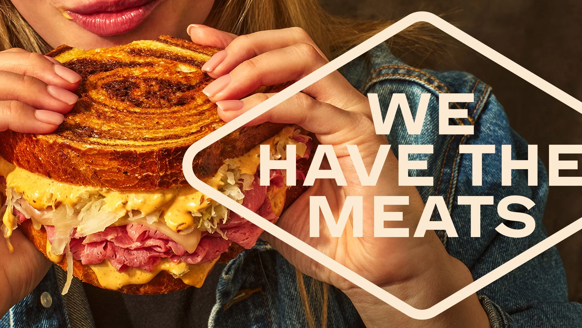
We rebuilt the brand around a modern butcher mentality: bold, tactile, and intentionally imperfect.
I helped shape a system-level refresh spanning typography, color, and photography—creating a visual identity that feels more human, expressive, and confident without taking itself too seriously.
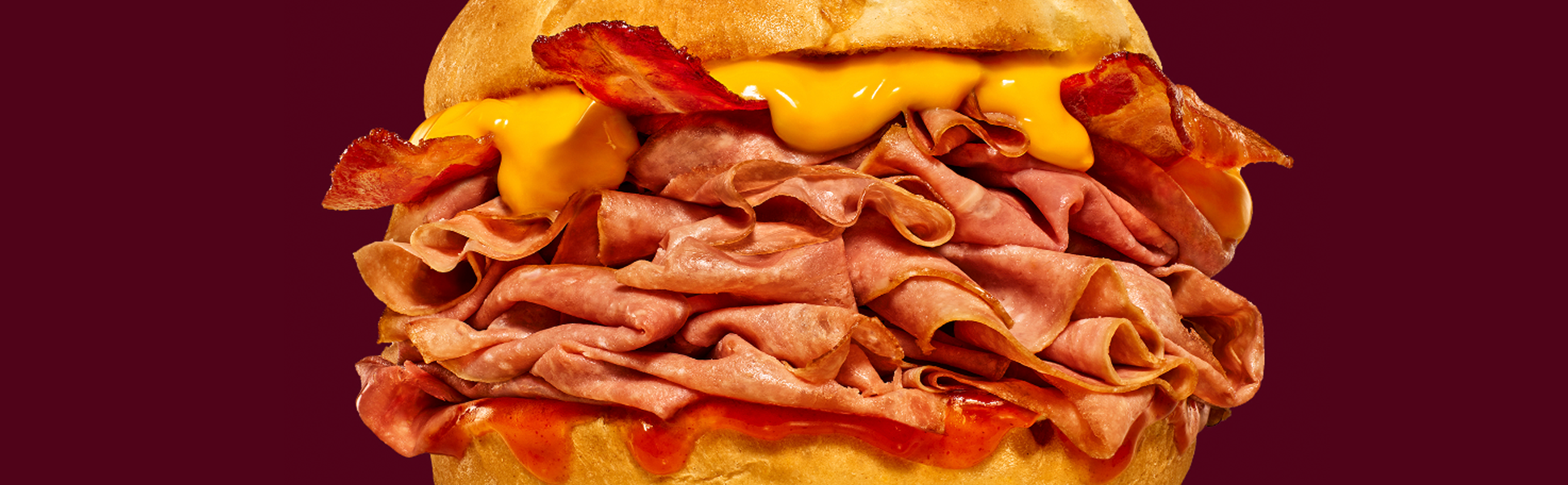
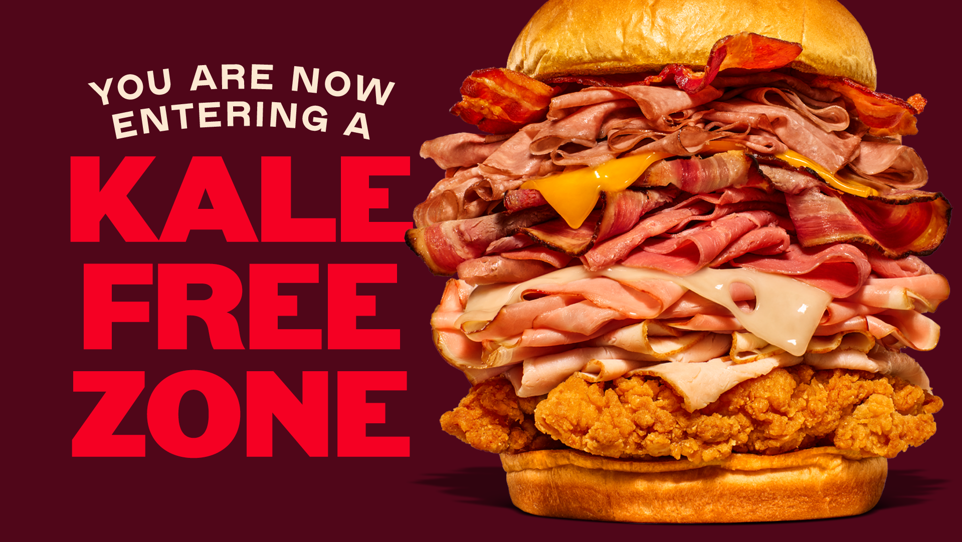
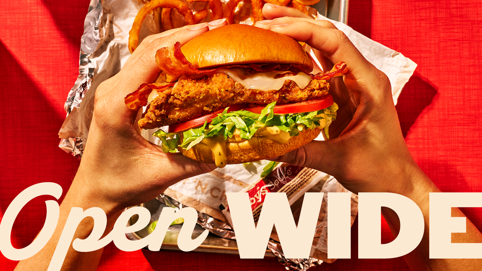
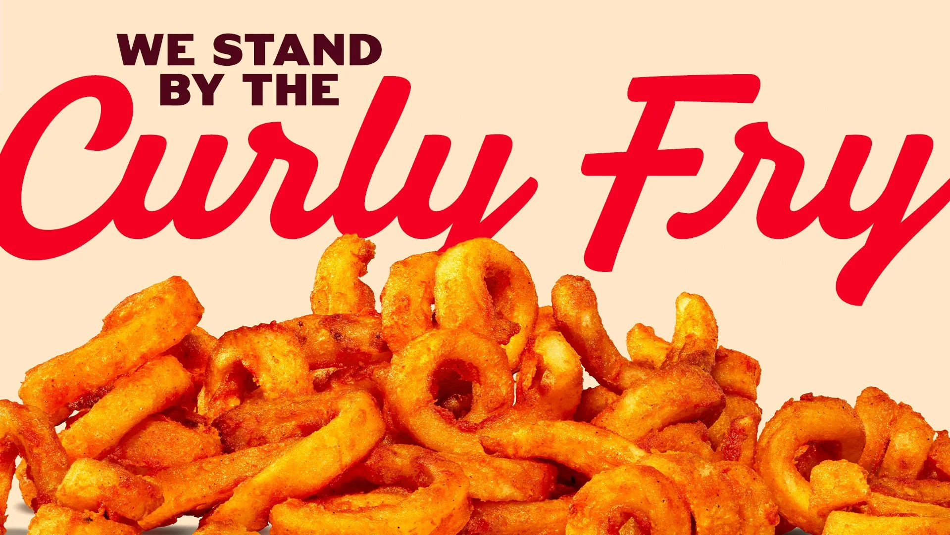
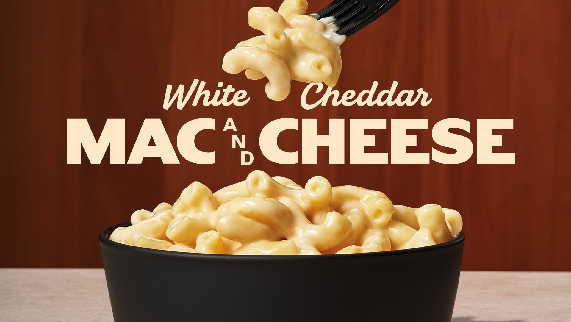
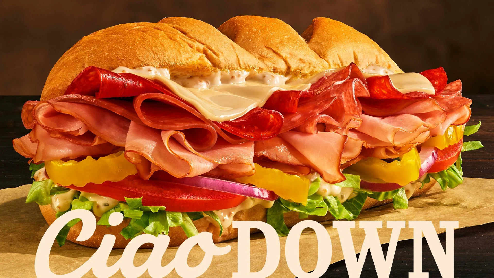
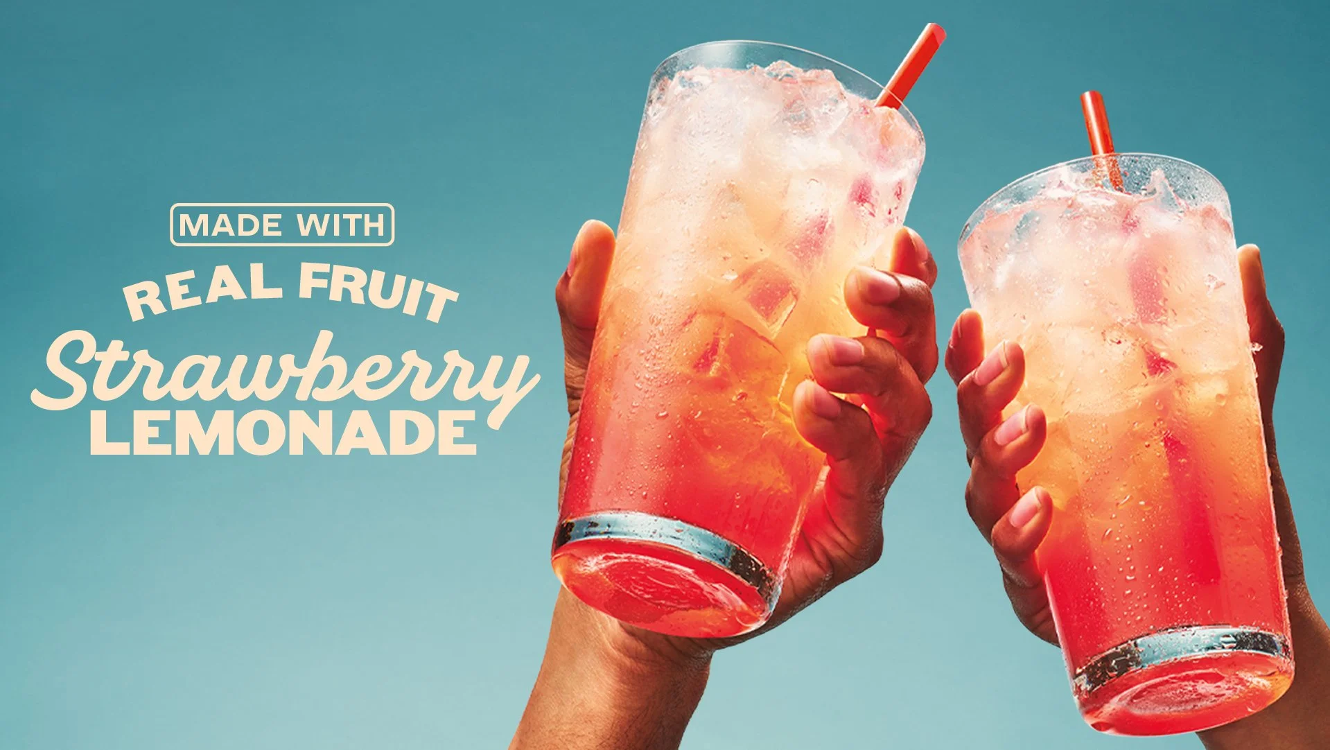
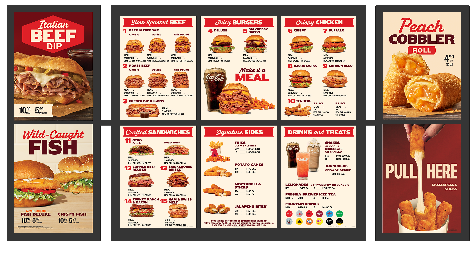
The update extended across the full brand ecosystem, from store environments and uniforms to a completely redefined visual identity system. We also re-shot the entire menu and LTO lineup, leaning into texture, drips, and controlled imperfection.
To keep it consistent at scale, we developed a “napkin scale” to calibrate just how messy each shot should feel—turning a subjective aesthetic into a repeatable system.
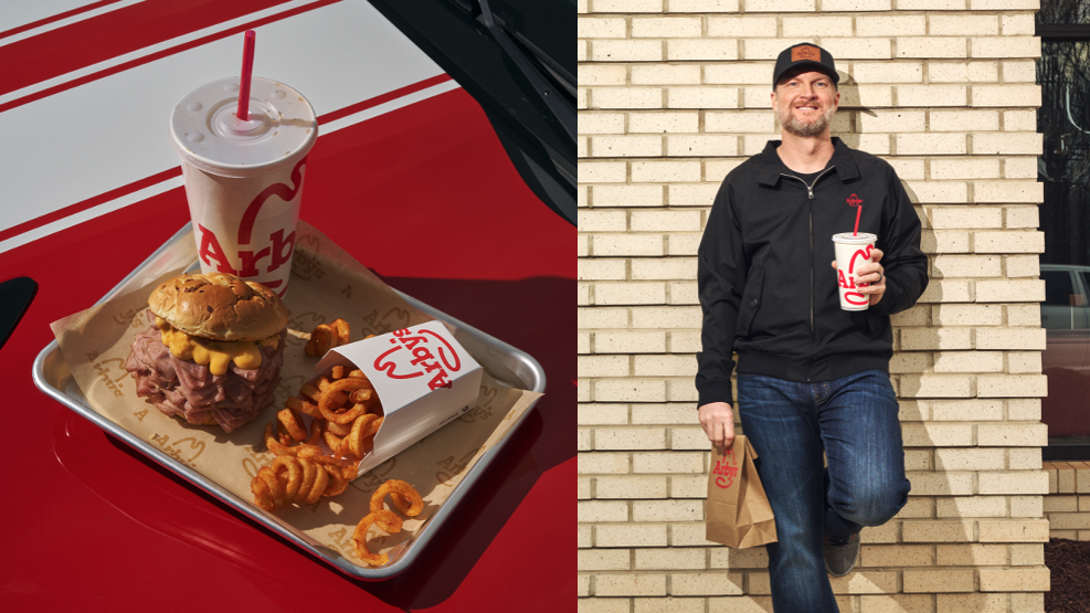
Arby’s photography was rebuilt to feel warmer, closer, and more indulgent—celebrating texture, drips, and real appetite appeal.
Bold type, confident layouts, and craveable photography turn the menuboard into a brand moment—not just a list of items.
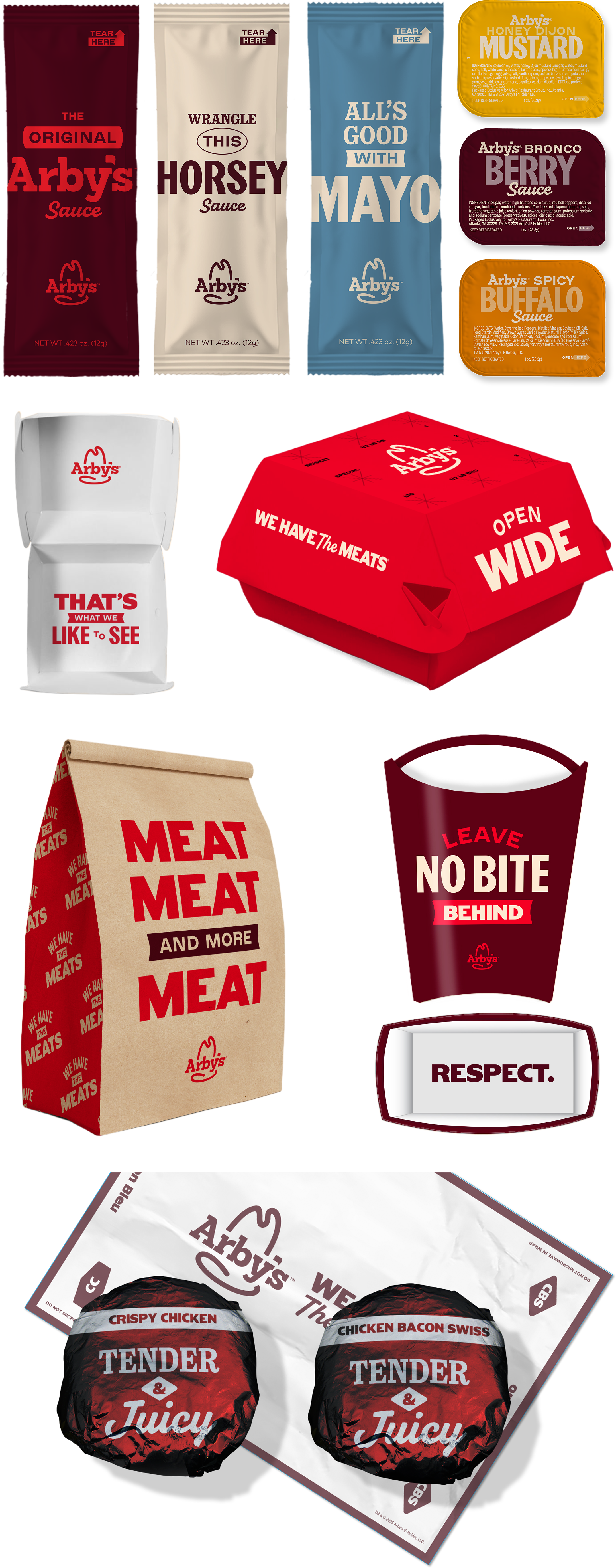
Packaging was redesigned as a bold extension of the visual identity—using expressive typography, graphic shapes, and color to stand out in hand and in store.
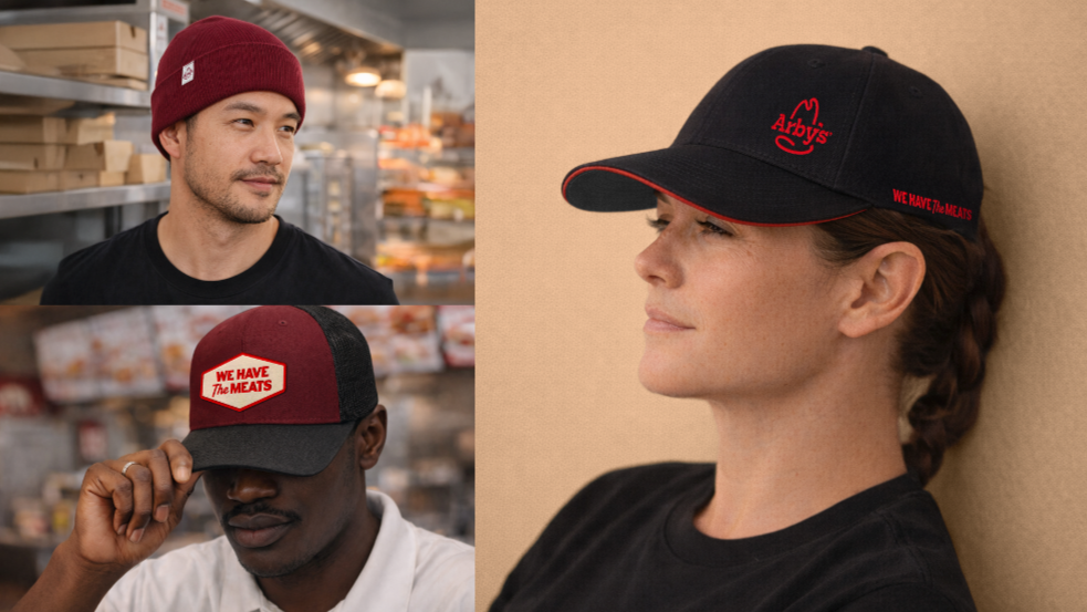
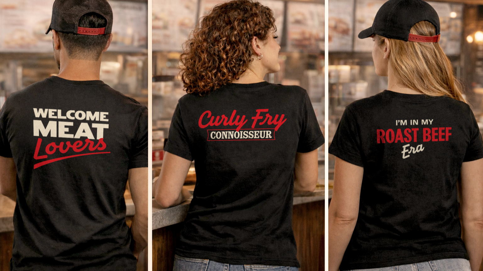
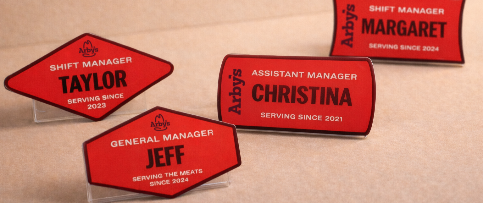
A brand refresh isn’t complete without the details. We redesigned core uniform pieces —tees, hats and badges — to match Arby’s new visual language while staying functional for everyday wear.
Limited-time launches demand constant freshness. Each month, we produce a new POP kit—complete with a dedicated shoot—designed to plug seamlessly into the larger brand system.